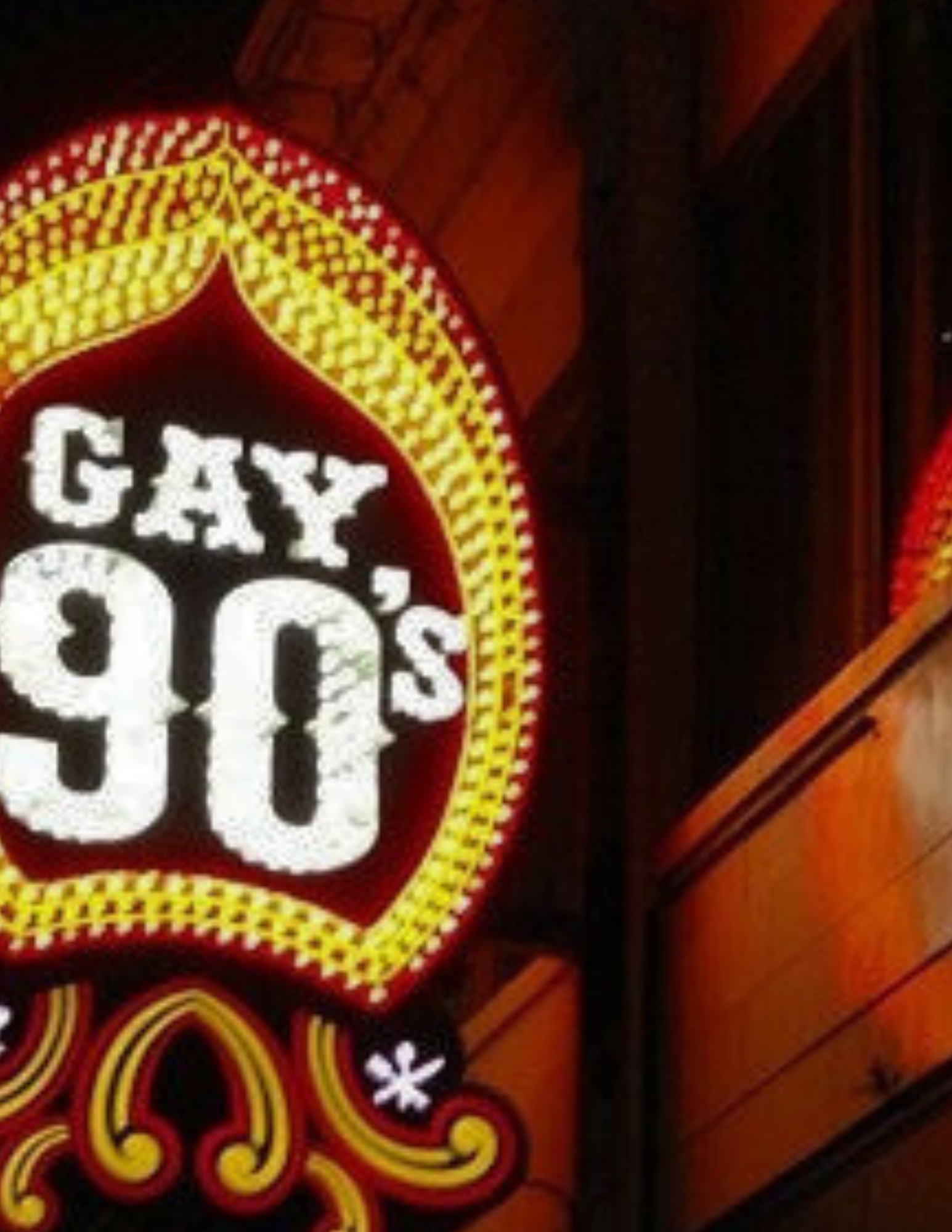
The GAY 90's"Given the stories that I've heard in the news and things I've been told by my friends I've started hanging out at other bars out of safety concerns"
Rebrand Theme
The Rebrand
We all know that the 90’s need a fresh look and fresh name. While a maintaining the status of being a Minneapolis Icon for the last 50 years, their recent nickname does not hold them in such an esteemed light… the STRAIGHT 90’s
The 90’s positioning themselves as an ‘all welcoming’ bar allowed them to survive through the pandemic but NOW it serves as a less sustainable business model following the resurgence of public space - queer Minneapolis feels threatened there and youth Minneapolis outages it quickly…
So what’s the solution? The following campaign outlines a Gay 90’s rebrand that allows them to maintain their new and sustainable business model while repositioning themselves as not only an accepting space but also an enticing and safe place for all.
Consumer Insights
"Overnight, the 90s became a straight bar, where people came to ogle at the drag queens"

Using history to inform inclusivity and reignite real community.
Initiatives
2
1
3
While a plethora of different strategies and tactics were implemented to facilitate each objective (see presentation) as creative director I spearheaded THE VISUAL REBRAND - a crucial and necessary element of the campaign
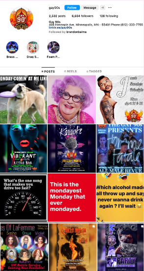
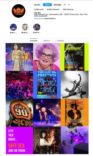
Visual Rebrand -Social Media
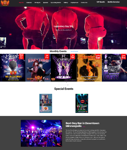
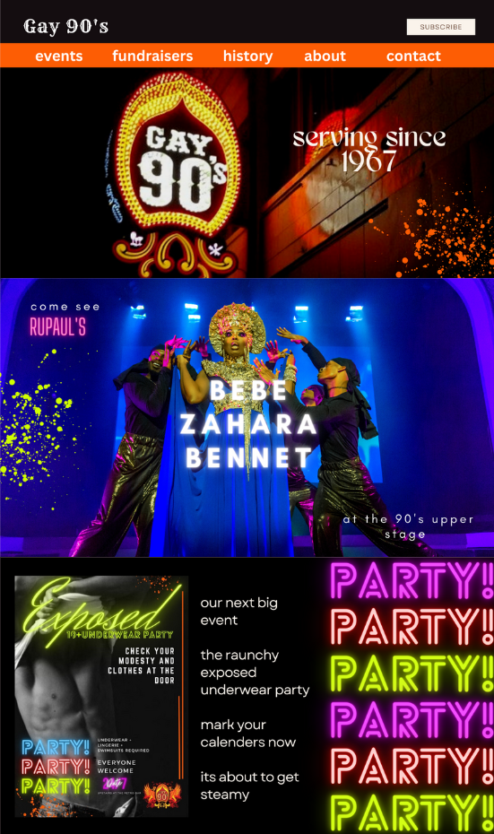
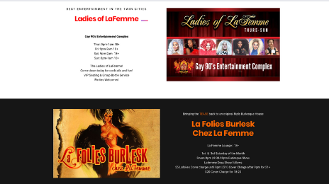
Visual Rebrand -Website
"As an upperclassmen I don't go there anymore because I know lot's of underage people who go there for the 18+ nights"
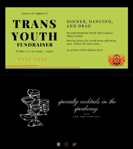
Community Centered Events/Fundraisers
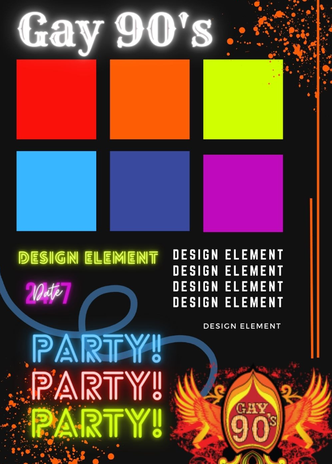
THE VISUAL REBRAND
SEE BELOW
THE PROBLEM
What is the Gay 90’s brand identity? WHo is their traget audience? What are their values? Gay 90’s previous website answers none of these questions
While having the potential to step into a strong brand identity centered around a long and vibrant history, the 90’s current website is hard to navigate, utilizes design elements of the early 2000’s and is so busy, its hard to know where to focus ones attention.
Their Instagram also lacks cohesion and overall expresses an unprofessional brand identity (utilizes memes)
Lets fix that
THE VISION
There are ways to maintain the 90’s vibrant an loud energy while remaking their image in a modern, sleek, and cohesive manner
To do this we started with selecting a color scheme and design elements that will play throughout the social and website visual rebrand
With history and inclusion in mind we aspire to have both the website and social more adequately represent queer voices and serve them through educational content and fundraising event promotion
THE SOLUTION
The new design is sleek, classy, cohesive, eye catching, and different. It emphasizes the best parts of Gay 90’s and leaves behind the parts that did not serve.
It positions the 90’s as a historical landmark and a community space that serves queer identities rather than harming them. It promotes fundraiser events/partnerships, and centers important educational content rather than humorous (unserious and unprofessional ) content.
With a simple visual rebrand paired with partnerships, suddenly Gay 90’s in again!